More than one billion people in the world experience a form of disability. You should be utilising inclusive web design to grow your traffic and create a better and equal experience for everyone.
Below we’ll outline 5 easy ways for you to make your website more inclusive.
We’ll also give you examples of best practices from the inclusive websites we built for So Joe and Paper Wings. Both operate in the disability sector.
So Joe is a disability service provider aiming to support opportunities for the everyday Joe. While Paper Wings aim to capture and share stories from those who have experienced life with a disability with those who are just beginning their journey.
Now that you have some background, here are 5 easy ways to make your website more inclusive.
1. Write in plain English
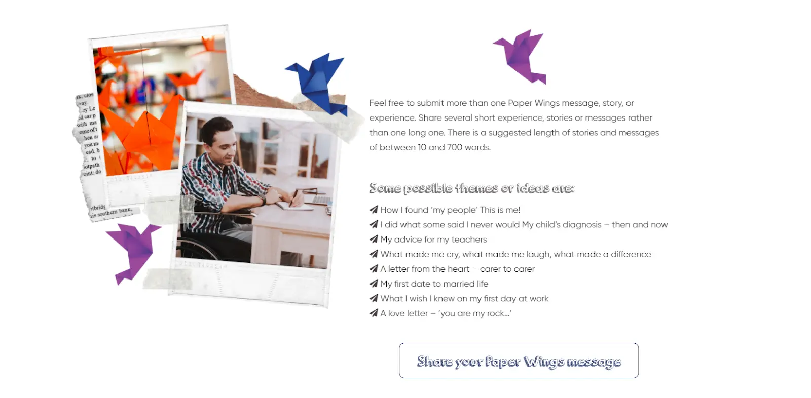
To ensure Paper Wings could effectively capture stories to share, we used simple language with clear call to actions (CTAs) throughout the site to direct the visitor to the main goal: complete the form to share their story. To reach a larger audience, you should aim for a reading level of a nine-year-old for most content and avoid jargon or acronyms.
2. Utilise structure
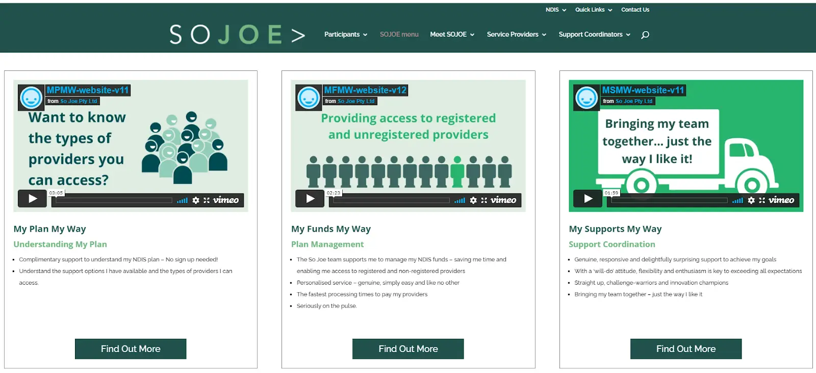
So Joe’s website utilises headers, subheaders and sections to break up their content into smaller, easily digestible pieces of information. This makes it easier or users with cognitive, language and visual disabilities to read.
3. Correctly mark-up your content
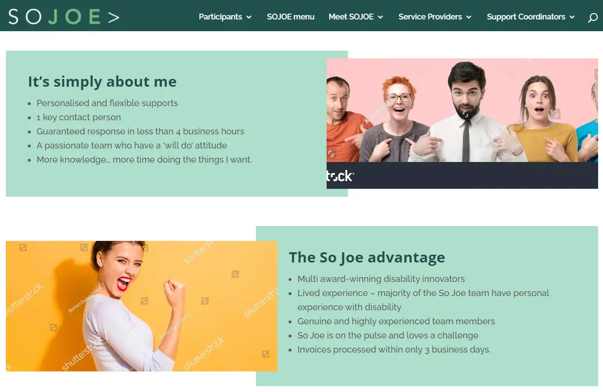
We’ve made it easier for visually impaired users to read So Joe’s content by using heading tags and HTML elements like the <button> tag in our code. This coding gives context to screen readers which are often relied on to read websites.
4. Write helpful alt text for images
Some users depend on alternative text (alt text) for interpreting an image. Make it easy to understand by describing what the image depicts and how it relates to the rest of the content.
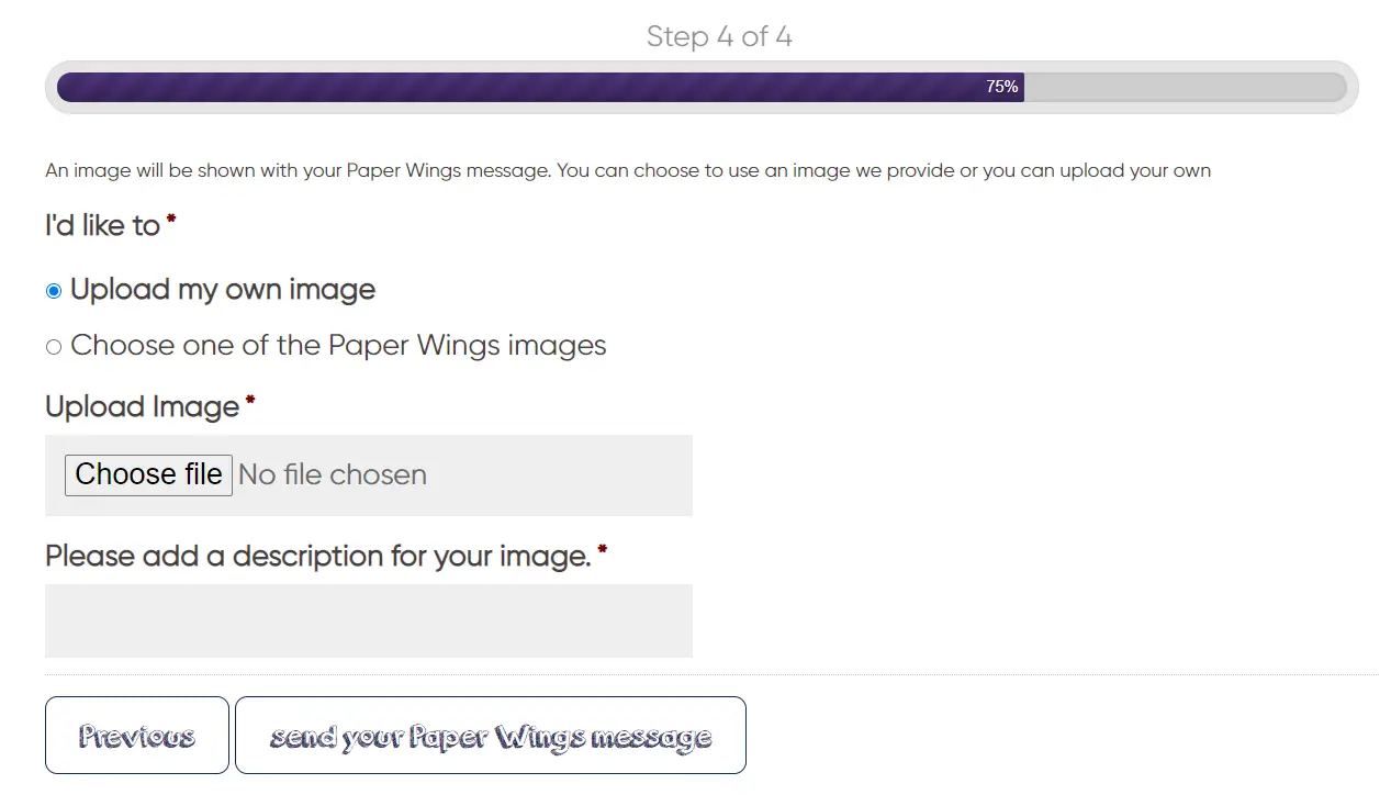
Uniquely, when you submit your story through the Paper Wings submission form, you’re offered the opportunity to submit your own image and describe it for others, this description then becomes the alt text.
5. Use descriptive labels with form field
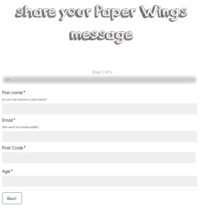
For both So Joe and Paper Wings we made it clear what we want people to do and write in a form by descriptively labelling form fields and avoiding placeholder text (screen readers often skip these). To avoid guesswork, you could even use small helper text above the form field.
Wrap up
By designing inclusively you’ll make sure no group’s needs or concerns are overlooked and you’ll grow your audience by ensuring everyone can access your content.
To learn more about how you can optimise your inclusivity, the Web Content Accessibility Guidelines (WCAG) outline a wide range of recommendations.
If you want help with making your web design more inclusive and accessible, get in touch with our team today!

