
The design of your website can be the difference between a user taking action or simply moving on. Creating an effective design means considering how users will interact with your site and what you want them to do when they visit. If you’re looking to add a little edge to your website, dark theme website might be the way to go. Adopting a dark website design can create stunning colour contrasts and still retain the opportunity to include imagery or other design elements that suit your brand.
Benefits of a dark mode website design
- Dark colours create a bold, eye-catching aesthetic that draws users in and makes your brand stand out from the competition.
- Dark mode can help emphasize important elements on your page, such as CTAs or other callouts. This makes it easier for users to navigate your site and find what they need quickly.
- Dark mode can also be easier on the eyes, especially for users with visual impairments or who spend a lot of time looking at screens. This makes dark mode ideal for sites that require a lot of reading or focus, such as ecommerce stores or educational platforms.
Tips for designing a dark mode theme website
First, it’s important to use light colours for text and backgrounds. This will ensure that your content stands out against the dark backgrounds, while providing high contrast for readability.
Second, choose fonts that are easy to read. Sans serif fonts are clear, simple to read and give a modern aesthetic. Additionally, make sure your text can be read on a range of devices – desktop, tablet and mobile. This is especially important for those who may have difficulty seeing smaller text.
Keep in mind that dark mode websites can be more difficult to navigate. As such, it’s important to design your site in a way that is clear and straightforward.
What makes a good dark theme website?
So, what exactly makes a good dark website design? For starters, sticking to one main colour for your background ― like black or blue ― can help create a cohesive look and feel across all pages of your site.
Additionally, using plenty of white space (the blank areas between different elements on the page) helps ensure that your site visitors can easily find what they’re looking for, even on a darker background.
Our favourite dark website designs
If you’re worried that a dark website design might make your site seem uninviting or too “out there,” don’t be! There are plenty of ways to incorporate personality into your site through the use of imagery, fonts, and copy. And, if you want to see some of the best dark website designs in action, we’ve rounded up a few of our favorites below.
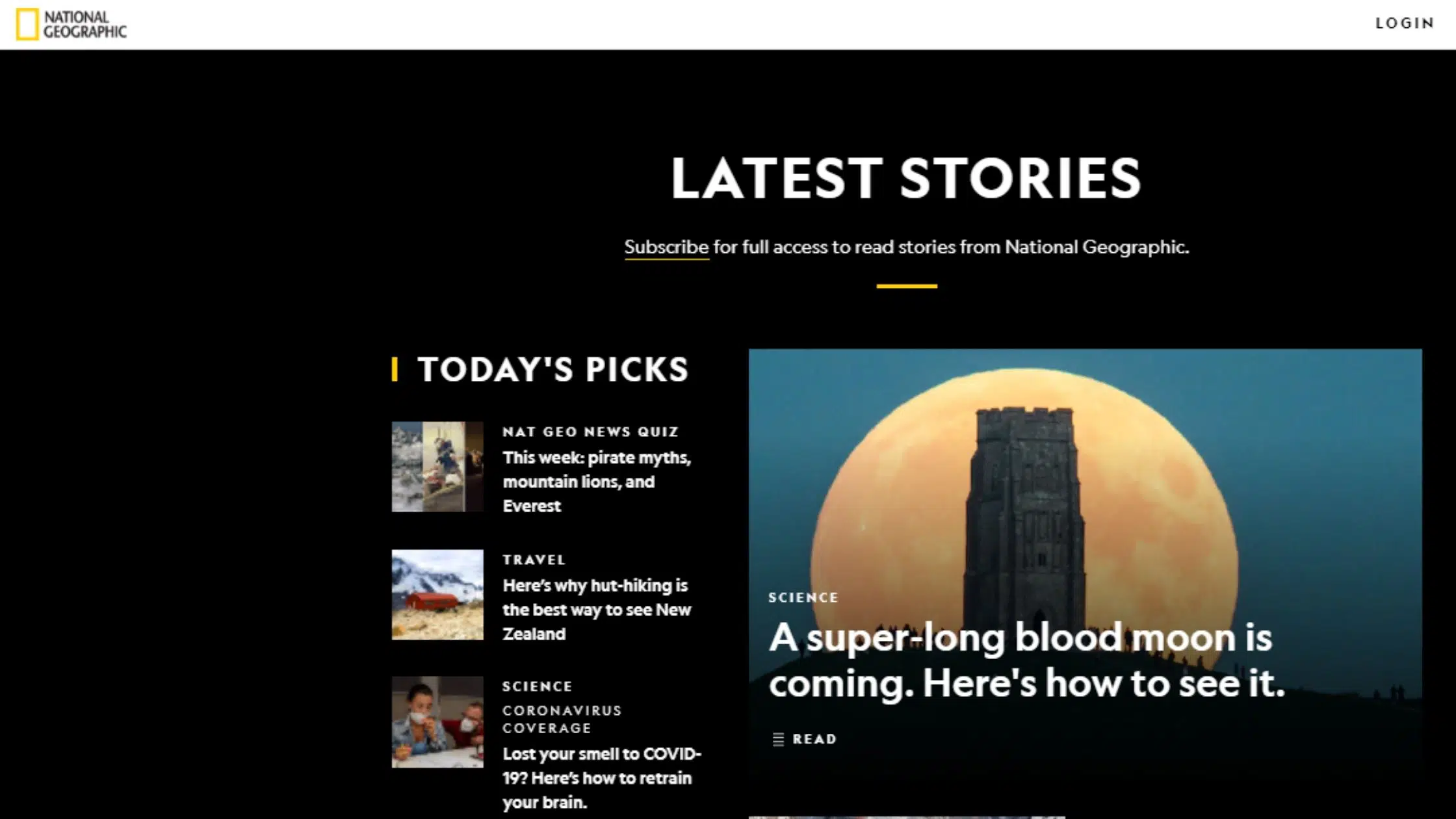
National Geographic
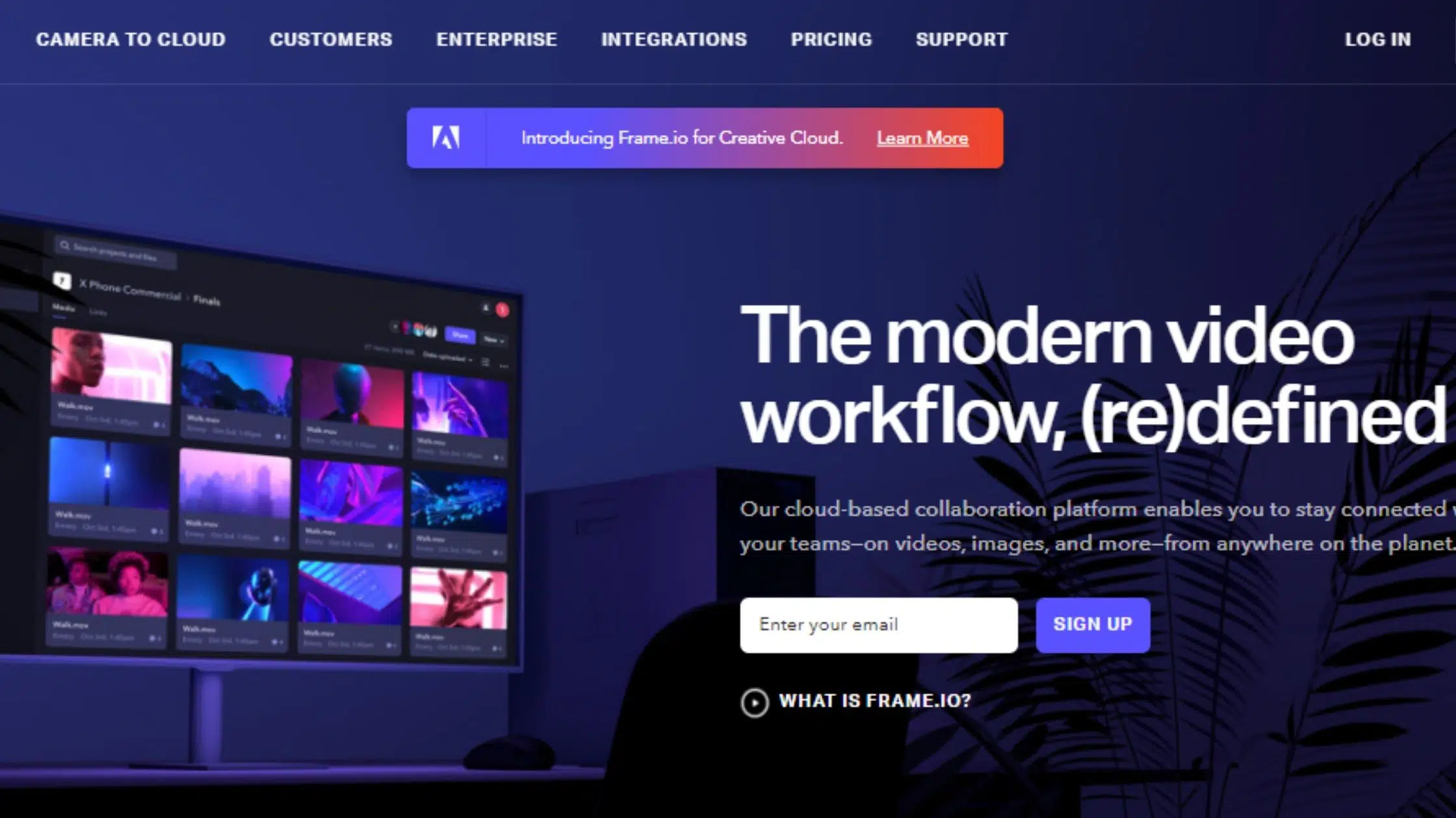
Frame.io

Voice of Racism

Github
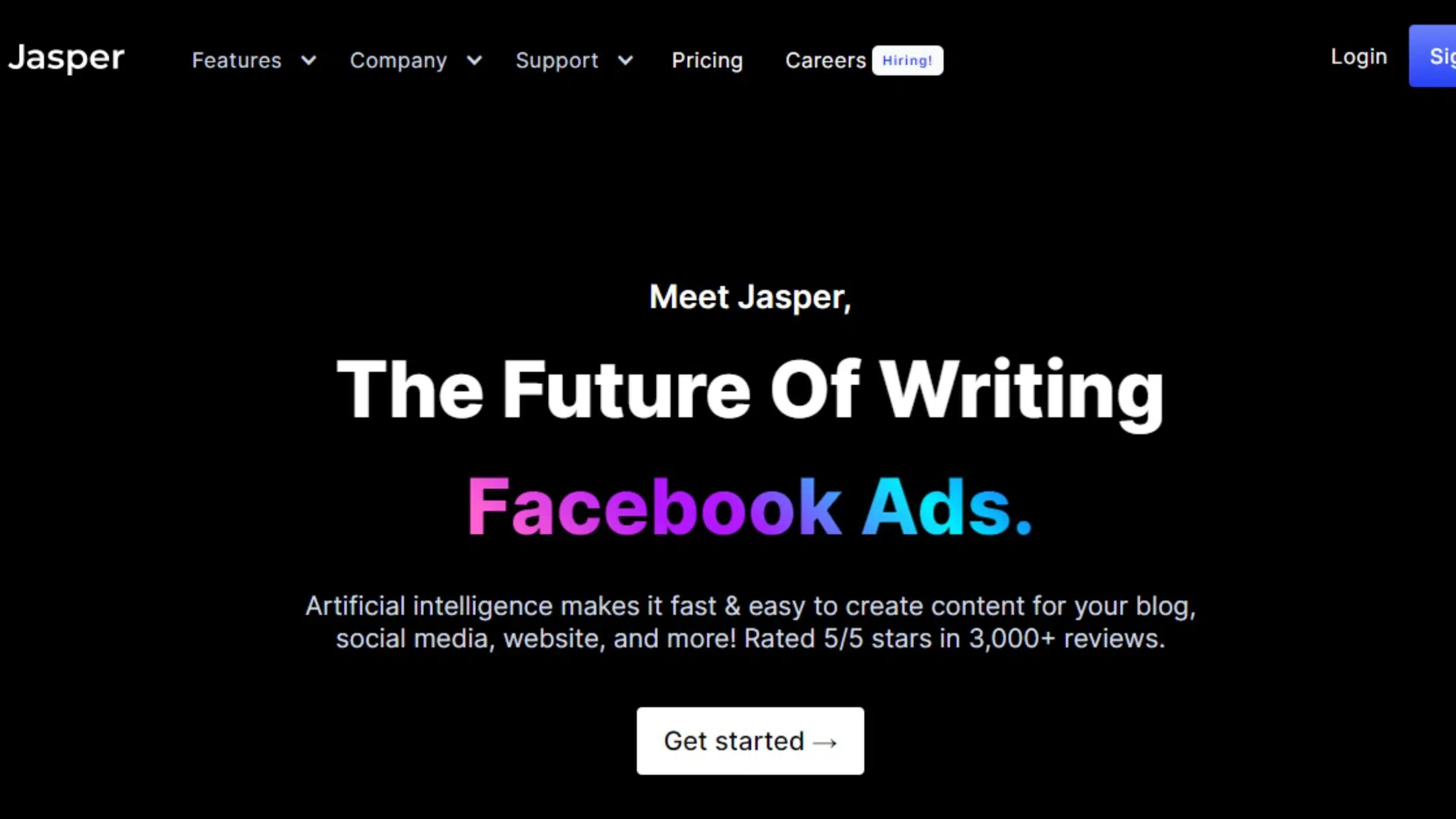
Jasper
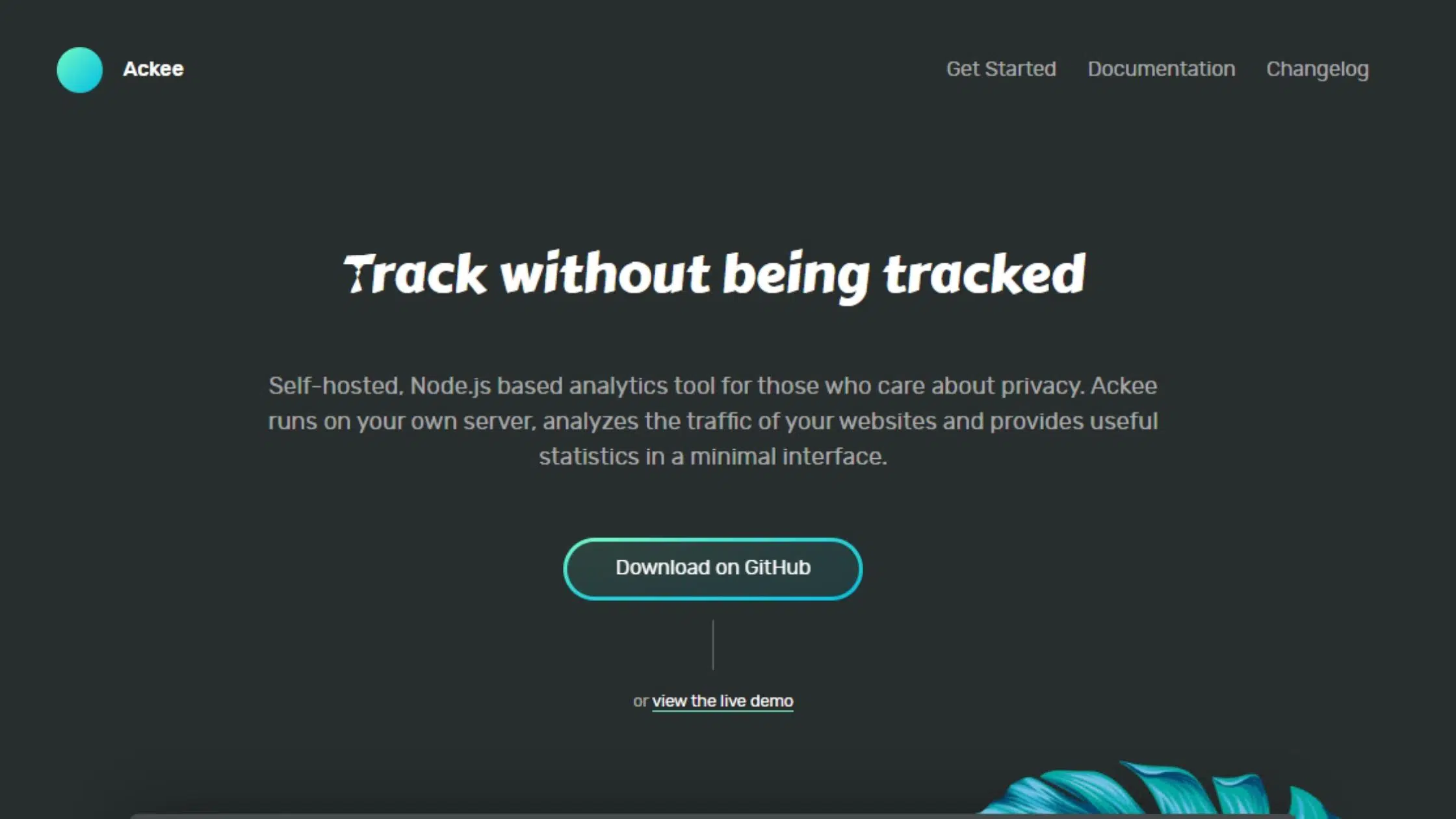
Ackee
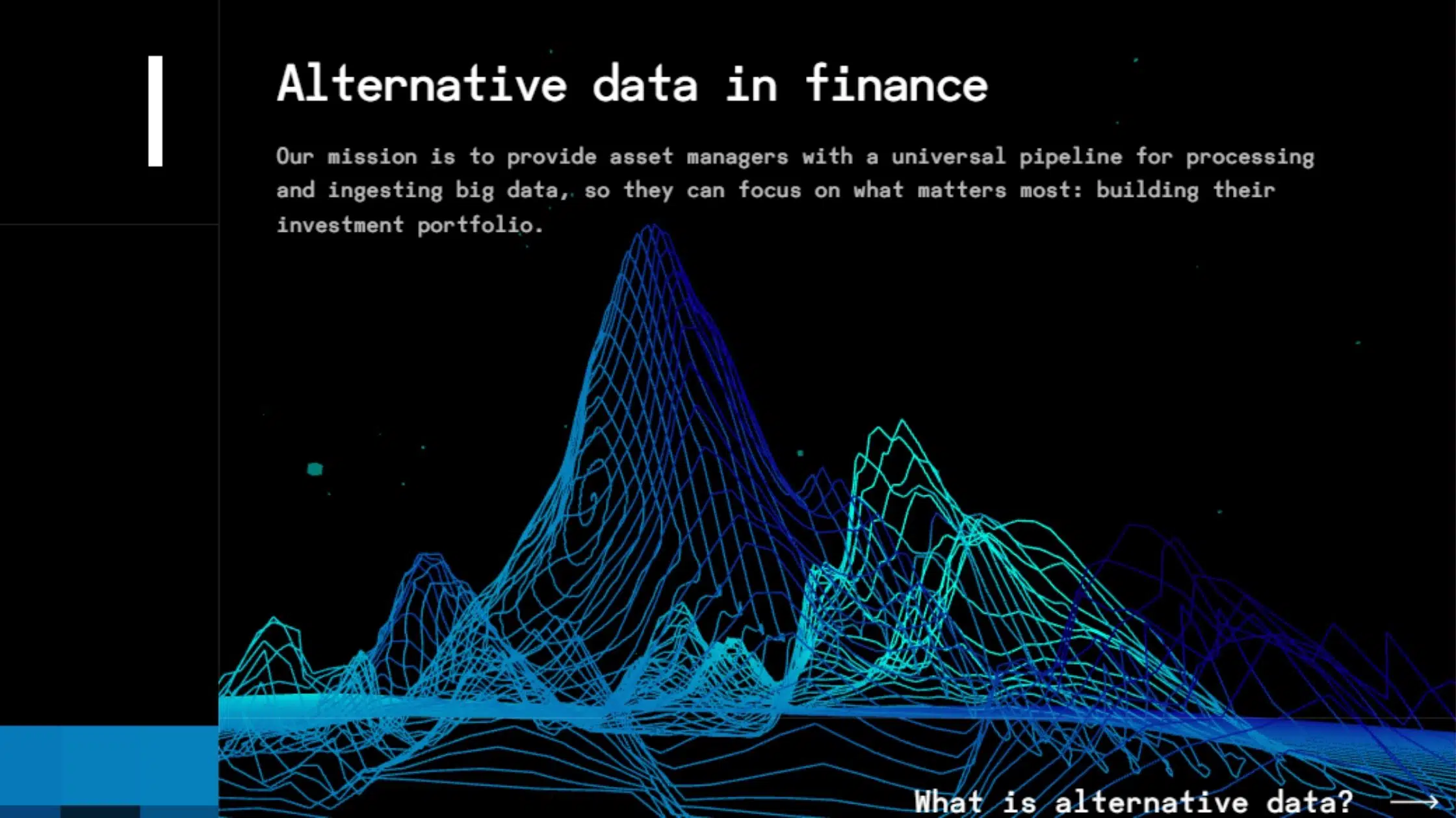
Data Fork
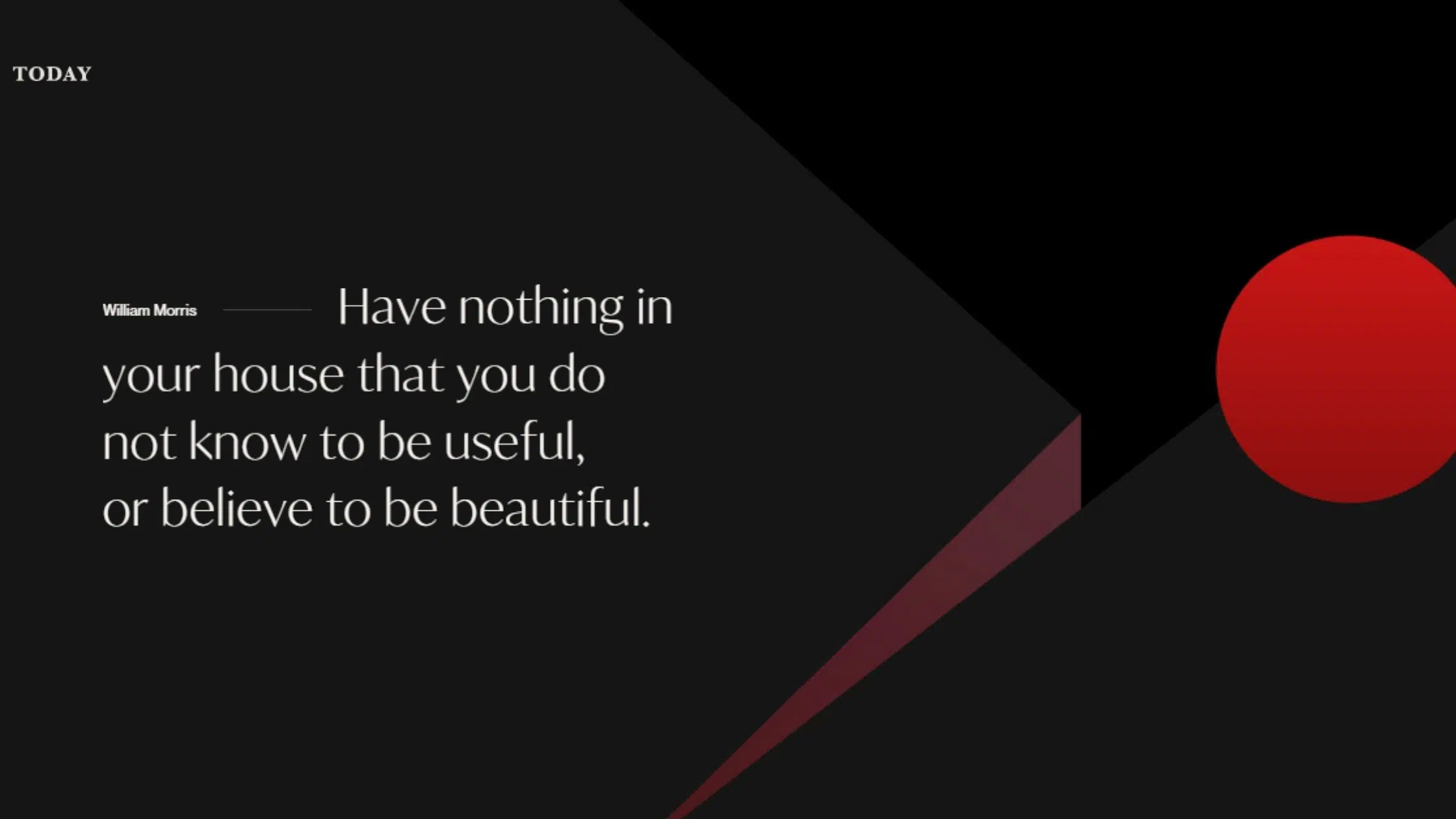
Today
Conclusion
The dark theme revolution is just getting fired up which means it’s the perfect time to get creative! If you want your site to be easy on the eyes with a bold design, and potentially increased conversions – it’s time to go dark!
Want to learn more about web design? Ready for a website revamp? Get in touch with our team today.